August 30, 2010

Collection Inspiration: Wahl Ring Top

There are soooooo many fountain pens out there! And, like many collectors in many other hobbies, pen enthusiasts often choose to focus their collections around a common theme, whether it be a manufacturer, color scheme, material or era. For a couple years now, I have purchased pens without any single thread to tie my collection together [aside from the fact that each pen spoke to me at some point]. I never actually felt much of a need to focus the collection, I figured that as long as I appreciated all of my pieces that it didn't matter if they were a cohesive grouping. That changed when I purchased my first ring top.

IMG_0740

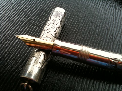
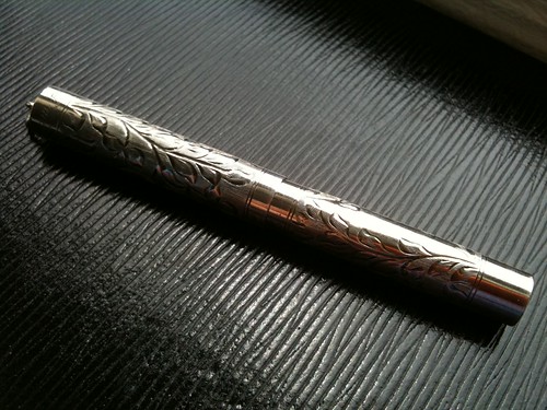
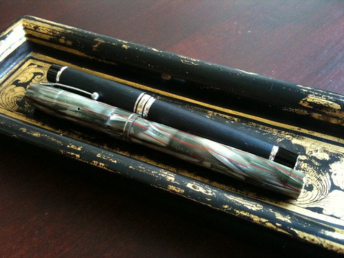
When I first saw this 1920s all metal, sterling silver, hand engraved, lever filling Wahl, I knew that it belonged in my pen case... and that it needed company.

Ring top pens were originally advertised as vest pens for men. They were worn with a short chain that attached to a button hole in the man's vest and were kept in a vest pocket. Later, for reasons not 100% clear, these same pens were advertised to women as ladies' pens, worn on a chain around the neck. Same pens, just different target markets. I've had considerable trouble accurately dating my particular pen, so I'm not sure whether it was advertised as a vest pen or a ladies' pen.

I searched around the internet on multiple occasions, and while I found Wahl advertisements for very similar pens on the Pen Collectors of America website, I'm not totally comfortable saying that the pen I own and the pen advertised are the same.

IMG_0732

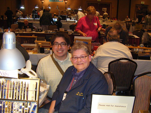
When I went to the Raleigh Pen Show in June I made a special point of asking around to see if anyone could give me information on my little pen. Unfortunately, no one could really give me any specifics beyond general information on Wahl all metal ring tops. I did, however, find a vintage Waterman ring top with a strikingly similar floral pattern. The Waterman vendor, Alan Hirsch, posited that this particular pattern may have just been a popular trend in the 1920s, meaning that the engravers from Wahl and Waterman probably didn't copy the others' design, but that they were probably inspired by a common third party design. To Wahl's benefit, Alan volunteered that my pen was prettier than the Waterman he was selling. I wonder what species of flower inspired the pattern, any ideas?

I thought for sure that my quest to find out more about my pen had ended, when through our personal correspondence, I found out that Julie from Whatever that she, too, had a sterling Wahl ring top. I held my breath, until Julie posted about her pen on her blog, and it turns out that our pens are twins!

Julie found the same Wahl ad that I did, and she's a tad more inclined than I am to believe that our pens are the very same model as the pen advertised in the vintage catalog.

IMG_0744

Historical ambiguities aside, this 4.5"-ish writer is one of my favorite pens. The all metal section is fitted with a Wahl No. 2, a very flexible 14k nib. When the pen arrived in my mailbox, the nib was a bit scratchy, even on the smoothest of papers. So, I had nibmeister Deb Kinney smooth my nib at the Raleigh Pen Show for a nominal fee, and it writes brilliantly.

I don't have a chain for this or any of my other ring top pens, yet, but I do plan on wearing them as vest pens in the future. Can you think of any places where I can get a deal on a sterling silver pen chain [or a double albert chain]?

I was so excited to purchase this ring top, and I look forward to acquiring [many?] more!

August 25, 2010

Vintage* Pen Tray

IMG_0716

As I was studying this summer, I de-stressed from time to time by engaging in a little retail therapy. Among the pen related items I purchased was this fantastic vintage pen tray. The seller advertised the tray as an authentic lacquered piece with gold accents from the early 1800s.

In years gone by, before the age of the fountain pen, when dip pens were the primary writing tool, writers needed a place to put their pens to prevent ink from getting all over their table, blotter, or writing surface. Their solution: the pen tray.

It was typical of finer pen trays to have arms, or a small rack, protruding from the tray [example 1, example 2] to hold the pen above the tray's surface, to avoid getting ink all over the pen. My tray doesn't have this feature, so it's possible [example 3] that it was not originally intended as a pen tray at all. It is possible that my little tray was instead used as a calling card tray - to present visitor's cards to the lady of the house holding visiting hours in her parlor [example 4]. Then again, it's possible that this tray just isn't authentic at all.

IMG_0715

While the tray certainly is lacquered, and it does have some wear and tear, it's unclear to me whether it is faux vintage or authentic vintage. It would be neat if the tray actually were 200-ish years old, but I'm not going to put many eggs in that wishful basket. Oh well, whether it's an authentic piece from the turn of the 19th century or a great buy from TJ Maxx, I still can't wait to display it on my future desk.

August 20, 2010

Traveling Mail Art Journal

IMG_0685

Things I love: personal correspondence and art. The incredible synthesis: traveling mail art journal!

Many many months ago, Bianca from Goodnight Little Spoon put out word that she was starting a traveling journal. Each recipient was to create 2-4 pages, with the only creative boundary being that the content had to be postally related.

I signed up immediately and was, I think, eighth on the list of journal recipients. Months passed and I eventually forgot that I was scheduled to receive the journal. But then, one day I got a package in the mail - not recalling any recent online purchases, I opened the package with suspicion. Well, wasn't I surprised to find the journal within!

IMG_0689

I spent the next several hours having a great time combing through all the fantastic mail art contained therein. People in the online mail enthusiast community are sooo creative. Many participants included personal messages, or mail to be read by all future recipients. The above picture of a mystery message left in the journal by Tejal at All-My-Hues.

IMG_0682

The creative bar was set incredibly high, and I took some time to gather materials to create my pages. After two days of twiddling my thumbs, I decided that I had to just start putting things on the paper. Above are my first two journal pages.

I included on the left page: the front cover of one of my favorite card sets, the priority mail stickers from the package that the journal came to me in, and some imagery from National Postal Museum flyers. On the right page: more National Postal Museum imagery, a hotel stationery envelope from a Washington, DC hotel, DC-ish vintage stamps, a snail mail stamp, and a collection of wax seals that include seals from envelopes sent to me by some of my wonderful pen pals.

I did do a third page, but I wanted to keep it specially for future mail journal recipients.

August 19, 2010

Fan Mail

I'm back! It's been a long summer, but I think it was worth it. I took the Maryland bar exam at the end of July, and then took a two week vacation in Minnesota to visit my family and friends. While staying at my parents' home, I decided to rummage around in their storage unit to see what sort childhood memories I could uncover. And sure enough, I found a couple of gems.

Agatha the Royal Portable Typewriter

This is my very first eBay purchase, a Royal Portable typewriter! I bought this machine over 10 years ago, placed it on a shelf, and then never used it. I'm so ashamed. To make it up to myself and the typewriter, I took it to Vale Typewriter in Minneapolis where Rich, the proprietor, was able to clean, scrub, and oil the Royal back into premier shape. There are still spots of rust, but Rich says that their spread should be halted by keeping them oiled. Here's to hoping.

3 Geeks Comic

In addition to my vintage typewriter, I found a small cache of comic books. I was absolutely thrilled.

As a middle schooler, I collected Green Lantern comics, and I had a few issues of independent titles, including the above pictured 3 Geeks comic. I totally related to the book, it was about a group of guys that hung out at a comic book shop, unabashed by their geekness. The guy that worked the shop counter was named Colonel, and the guy that manned the counter at Uncle Sven's Comic Shoppe in Saint Paul where I hung out was also named Colonel! It was as though I had no choice in buying the comic.

3 Geeks Page

I'm writing about 3 Geeks here on Everyday Correspondence because, wouldn't you know it, the premise of issue 5 is about writing letters to comic book authors and artists. In virtually every printed comic there is a page or two at the end of each book dedicated to the mail bag, where fan letters are printed and the author of the book responds. While I've never written a fan letter to a comic, I'm lead to believe that having your letter printed is the ultimate honor for a fanboy (or fangirl).

Well, having come upon both a typewriter and 3 Geeks issue 5 in my parents' storage unit, I felt compelled to write my first ever comic fan letter to the creator of 3 Geeks. While I doubt that my letter will be printed, I take satisfaction in giving a creator appreciative feedback for his work.

Have you ever written a fan letter to an author or artist? Have they ever written back? Have you had your letter printed in a comic book?

July 20, 2010

Everyday Correspondence and PNT in the News!

Last week I was contacted by Matt Frassica, a reporter for the Louisville Courier-Journal, who was writing an article on e-mail etiquette, and was impressed by PNT's guest series on valedictions. Long story short, I put PNT (real name Preston Thomas) in touch with Frassica - and a story was born!

In the article, Preston is catapulted to the same plane as etiquette authorities Peter Post, grandson of Emily Post, and author Will Schwalble. Out of all those interviewed, however, Preston is the only one who gives a good challenge to the status quo - and for that I applaud him. For example, Frassica writes that:
Thomas said that "Thanks" owed its pre-eminence in business correspondence to laziness and a pack mentality."

If you break the norm, you seem like the odd man out," he said. "Maybe the solution is just to grow a spine, put some thought into it and actually pick a word" that fits the situation, he said.
For additional quotational gems, you may read the full article available on the newspaper's website.

And since they're topical, here are links to past Everyday Correspondence posts on epistolary etiquette, valedictions, and Emily Post.

June 16, 2010

A Summer Break

Dear Readers,

To you I offer my apologies, I have gone almost six weeks without a post and no explanation as to why. As some of you may recall, I am (or rather was) in law school. This year, the month of May brought me not only my usual final exam period, but my last final exam, period!

I graduated from law school on May 28 and have been feverishly studying for the bar exam ever since, an exercise that requires an incredible amount of time. That is why I have not had the time, or the content necessary, to update Everyday Correspondence. The bar exam is the last week of July, after which I plan on taking a two week vacation to sunny Minnesota. So, while I may publish a post every couple of weeks, it is my sincere intent to return to Everyday Correspondence with my previous level of dedication sometime this August. I hope you'll all drop by for a visit.

Me with Deb Kinney, after she fine tuned a couple of troublesome nibs, at the Triangle Pen Show.
As you can see, I'm a very satisfied customer.

In an unrelated note, I attended the Triangle Pen Show in Cary, North Carolina a few weekends ago and had an amazing time! I'd like to give shout outs to the helpful seller Fred Martinson, the informative pencil master Joe, the Chilton guru Hirsch Davis, the humorous Tom Mullane, the deal maker Alan Hirsch, and nibmeister Deb Kinney. Each of these individuals proved to be great resources for pen history and information, as well as wonderful people from whom to buy. I recommend them all to people interested in pens as writing tools and/or objects for collecting. If you're interested in what a pen show experience is like, I recommend Richard Binder's series of posts, A Virtual Pen Show.

May you all have a magnificent summer, I will see you in the Fall!

Very truly yours,

James

April 30, 2010

Friday Night Favorite Reads

Map Envelope at Letter Writers Alliance

The (small) World of Ring Tops at Stylophiles Online Magazine

Pneumatic Mail at National Postal Museum website

April 25, 2010

National Postal Museum, Part III: Artifacts

After passing through the lobby, where I learned about the history of the National Postal Museum itself, and meeting the characters that have played important roles in the history of the USPS, I explored the artifacts that make postal junkies eek with joy.

I'm not why, but the Postal Museum seems to have a large collection of artifacts and exhibits focusing on the Postal Service in the 1940s. Then again, it could just be my own personal interest filter, and I chose to pay most attention to displays from the WWII era.


The beautiful vehicle above is a mail delivery truck from the early 1940s. The truck, while very different from the trucks of today, was a dramatic improvement over the original automobiles put into service in 1899. In the first test run, through snow, the automobile completed a six hour route by horse in under two and a half hours.

In addition to this mail truck, the museum also has a walk through mail delivery train and a roped off Pony Express stagecoach, neither of which I took photos of. Sorry. Maybe this is evidence of the existence of the aforementioned personal interest filter...


Which brings me to this piece of ephemera. Above is an envelope that was mailed to James Farley, Postmaser General from 1933 to 1940, by his vacationing son. What interests me so much about this envelope isn't so much that it was forwarded to Farley in a classified location, but that the envelope appears to be from a collection of stationery from The Stone Tavern in Lake Spofford, New Hampshire. I'm a big fan of hotel stationery (I have a letterhead from Hotel Mecca in the image archive) and am sad that is has slowly gone out of fashion.


Close to the letter to Postmaser Farley is the above envelope. The reason this piece is significant is not because of the individuals that mailed or received it, but because of where it was processed. The envelope was processed through the Honolulu post office on December 7, 1941, the day of the of the attack on Pearl Harbor.


In front of the museum book store and the stamp store, there are rows of mail boxes from around the world. Some of these box styles are out of date, but many are still still in use in their respective countries, standing on corners, hanging from lamp posts and telephone poles.


Can you guess which countries these boxes hail from?


At the end of my museum visit, I spent a good amount of time in the museum bookstore. In many ways, the bookstore of the National Postal Museum is a continuance of the museum experience. There is a long wall of shelves, filled with books on letter writing, mail art, stamp collecting, and historical perspectives on correspondence. I took the picture above because two books caught my eye, Good Mail Day and Yours Ever, both of which have been big hits in the online letter writing community in the last year.


I purchased the above two items as souvenirs from my experience. The first is the book The Art of the Handwritten Letter. The author, Margaret Shepherd, focuses much more on the emotional, human side of letter writing, rather than the rules of etiquette, an attempt to persuade the reader to actually sit down, write, stamp and mail. She writes many great reflections on letter writing, some of which I will be using here, on Everyday Correspondence, in the coming months.

The bottom picture is of a first day issue stamp and envelope commemorating Freedom of the Press. The NPM store has a pleasant selection of first day issues, easily numbering in the hundreds for visitors to sort through. So, it wasn't difficult to find a first day issue with personal significance for me to purchase. I plan on framing it and hanging it in my printing studio (aka my living room).

I had a afternoon visiting the National Postal Museum. While neither very large nor heavily visited, the museum has lots to offer, especially for the postal enthusiast. After all, we're the type of people that just love reading placards, aren't we?

April 22, 2010

Site Design Update

Dear Readers,

I'm looking to update the appearance of Everyday Correspondence (beyond just font changes). I haven't made any decisions on changes yet, so I beseech your help. What can I change/add/subtract to make the site more cohesive? How can I alter the design to better reflect its content? Would it be helpful to widen the main column, so that images may appear larger? Is there any information that would be helpful for me to add to the sidebar?

Suggestions are invited!

Very truly yours,

James

April 21, 2010

Adventures in Letterpress: QR Code Calling Cards


Because correspondence is communication by letters, I don't see why the definition should exclude written communications between individuals that are face to face at the time of delivery. Enter: the personal calling card. Lacking a card of my own, I set out to create one that represented me as an individual. That card needed to honor the traditions of the past, while still being innovative and fresh... with a dash of mystery. Really, I wanted a card that was artistic, yet functional.

A QR (quick response) code is a lot like a barcode, in that it contains information that is displayed when read. However, unlike a barcode, a QR code can carry up to 4000 characters of information, direct a device to a URL, load contact information, or queue up GPS coordinates. Already big in Japan, QR codes are slowly making their way over to the States.

The moment I learned about QR codes, I knew that they were for me. So, I created a code of my own (using the free QR code generator at Kaywa.com) and letterpressed them onto 110 lb. florescent white Crane Lettra paper, using my unique letterpress printing method.

My QR code doesn't hold very much information, only my name and personal e-mail address. So the card doesn't make full use of the QR technology, but that wasn't really my objective. With these cards I wanted to blend the hi-tech with the low-tech. I think it's amazing that early 20th century technology can be used to transmit information directly to modern, 21st century devices.

Unfortunately, I can really only hand these cards out to other technological early adopters, as only smart phones, such as the iPhone and Android devices, can run the software necessary to read QR codes. However, while smart phones and QR codes become ubiquitous, I'll still continue to hand out my QR cards to the people I meet. If anything, they'll be a conversation starter. After all, isn't good conversation what correspondence is all about?

Old School Writing Instruments Featured on New $100 Bill

As noted by the Crane Insider, the United States Treasury just unveiled the new design for the $100 bill, printed on Crane paper, like dollar bills of other denominations.


The new design prominently features a quill pen and an ink well. Thus, it receives the Official Everyday Correspondence Stamp of Approval.


April 17, 2010

Adventures in Letterpress: Calling Cards En Vivo

Last week I had the pleasure of printing up some personal calling cards for the brother of a friend. In barter for the cards, the brother sent me a set of lock picks, which I really enjoy fooling around with. Figuring that a guy who barters and plays with lock picks is probably a giant nerd, I decided to record the printing process for his cards. And, because he gave me permissions, and so did the other friend whose cards are being printed in the video, I figured, "why not just share the video with the Everyday Correspondence community?" And so it was.

Without further ado I present to you: Hacking Letterpress, letterpress printing on an 1890s squeegee. Please, enjoy.

April 15, 2010

Adventures in Letterpress: Save Our Date Edition


Finally! I am in the calm between the mid-semester flurry and the final exam crush. To fill my time, I've put in many hours on the printing press to turn out a couple of projects for myself and some friends.

I finished this run of 75 save the date cards a couple of days ago. The hand lettering was done by the delightful Lisa Ridgely. The rest of the design was done by me, using my new favorite tech toy, Adobe Illustrator. The cards were printed on 110 lb. florescent white Crane Lettra, a luxurious paper designed specifically for letterpress printing.


Every time I do a run on one of my presses, I find new ways to increase the efficiency of my process. This time around, I took a tip from Boxcar Press that they made for hand inking photopolymer plates (seen above) and requested that they not trim the edges of my photopolymer plate order. I then took those edges and used them as bearer strips along the sides of the plate I was inking. These bearers keep my roller (also known as a brayer) level and at the same height as the plate while inking. This little trick facilitated more uniform ink coverage on the plate, and it saved me a bunch of time in not having to wipe up smudges accidentally left by my uneven hand on parts of the plate I didn't want printed (the blue areas in the image above).


I also took the sage advice of a poster on the letterpress listserv from the University of New Brunswick that I subscribe to, and built my own drying racks. The above rack cost me a total of $3 to make. I used two slinkies ($1 each at Target) and taped them to a piece of scrap wood ($1 in the As Is section at IKEA). It was super cheap to construct, holds a good amount of paper, and saves me tons of space. Before, I was laying cards out flat on every flat surface in my home!

Next project: personal calling cards.

April 2, 2010

Postal Artifacts, on Display and In Use


It's Spring in Washington! And that means cherry blossoms and beautiful weather, both of which I spent the entire afternoon, yesterday, enjoying. While waiting for a friend to join me on the National Mall, I stopped into the Smithsonian Castle. The original home of the Smithsonian institution, the Castle now functions as a giant information desk for the network of museums, hosting small displays of items that represent the many museums in the area. Of course, the two items that drew my eye were those representing the National Postal Museum.


Originally used for mail collection in 1885, this charming lamppost letter box now sits just inside the side entrance on the front side of the Smithsonian Castle. It is mounted on a large plaque that informs the visitor about it's origins, and, it collects mail. If you're in the area and really need to send a post card, mail is collected twice daily.


Further inside the Castle I found this antique mail box. And I do mean mail box, in the most literal sense of the word. According to the placard, the tin can mailbox was used around 1950 in Hawai'i. Contents were soldered shut for delivery from boat to boat, or boat to shore. Unlike the above lamppost letter box, this tin can has been decommissioned and now resides behind glass.

March 17, 2010

Happy Saint Patrick's Day!


A happy St. Patty's day to all you wonderful readers, both those that are Irish and just Irish for today! In celebration of this wonderful day, the Quo Vadis blog is giving away free bottles of J. Herbin green and orange ink, really.

Sláinte (cheers)!

James

March 16, 2010

National Postal Museum, Part II: Characters


Once you actually go through the historic lobby of the the National Postal Museum, you enter a large atrium, around the sides of which are the entrances to side rooms. Each side room focuses on different eras, methods of delivery, and persons important to the history of the United States Postal System. The exhibits on postal figures were some of my favorites, as they really deepened my knowledge of individuals that I though I already knew a lot about. For starters, history classes frequently highlight Benjamin Franklin's accomplishments as a scientist, founding father, and French envoy, students rarely learn very much about Franklin's role as the first Postmaster General of the United States.


Another character that gets lots of exhibit space in the museum is Franklin Delano Roosevelt. This may be well known by older Americans, but I had no idea that FDR was into philately! In fact, he was so well known as a stamp collector that he was often given gifts of stamps by foreign diplomats. Above is a reproduction of a campaign poster for FDR, hung above the President's stamp collection box. Just before the President's death, a friend had offered to have the box recovered, as a gift. After Roosevelt's passing, the friend returned the box to the Roosevelt family, so the mail tags you see on the box are original from that trip through the post. Below is a picture of another gift given to the Roosevelt, a shelf that the President put on casters and used to wheel about his books of stamps.


In another part of the FDR exhibit, placards explain how the President used postage stamps as a means of improving the national mood during the Great Depression of the 1930s. It was under Roosevelt that colored stamps were first introduced, in wonderful greens and pinks. So into stamps was the President, that he even designed a few himself. It's amazing what you learn when you actually take the time to read the plastic cards next to everyday looking objects.


At the far end of the atrium, there is a walk-through exhibit all about postal inspectors and the perpetrators they catch. I didn't feel quite right taking pictures of mail bombs and the whackos that send them... so I instead took this picture of a poster that gives pointers on how to identify a dangerous package. All around this poster are stories of train robbers (that stole mail carried by train), the unabomber, and the postal inspectors that spent much of their lives pursuing them.

Fascinating.

March 11, 2010

Correspondence as Memories

[click image to view full size]

While blotter paper sits on the back burner, I would like to share with you another zine submission that I received. This submission is from Jackie over at Letters & Journals, titled "Correspondence as... Memories."

Thanks Jackie, for your wonderful reflection on the lasting power of letters!

March 10, 2010

Mail Mary: A Postal Mystery

A little philatelic humor via GirlZootZilla:

The Daily Show With Jon StewartMon - Thurs 11p / 10c
Mail Mary
www.thedailyshow.com
Daily Show
Full Episodes
Political HumorHealth Care Reform

LaFayette Brewery, Inc. Vintage Letterhead


In response to The Missive Maven's latest letter to me, the one with the cool rubber stamps, I sent back a letter written on paper printed with my most recently refurbished vintage letterhead image.

I'm especially proud of this new letterhead, from the LaFayette Brewery in LaFayette, Indiana. I think it's a really high quality image, and it should scale and print much better than previous letterheads I have posted.

This letterhead is now available for download in the Vintage Letterhead Image Archive. Also in the archive is a new image that has been available for a couple of weeks. While I didn't post about this new image, I did announce its addition on Twitter.

March 9, 2010

Rubber Stamp Awesomeness


It came as no surprise to me that these peachy keen rubber stamps came to me via a letter from The Missive Maven. She's constantly acquiring smart new letter writing accouterments.

March 5, 2010

Friday Night Favorite Reads

Unwritten Letters Project, I have no idea how I haven't come across this before!

Jiminy Clickit at Bleubug

Mailer's Postmark Permit #1 at WildPostcards.com

Sailor King Cobra. Hisssssss. at Leigh Reyes. My Life As a Verb.

Etch-A-Sketch Redux at Front Room Press

March 4, 2010

National Postal Museum, Part I: Victim of "Modernization"


All last week I tweeted with excitement about my day trip to the National Postal Museum here in Washington, D.C. Finally, on Friday, I was able to spend several hours at the museum, snapping pictures and ogling gorgeous stamps, reading letters of significance and learning about postal inspectors. While it was not my first trip to the museum, it was certainly my most enjoyable visit (probably because I was there alone and could take my time reading all the placards that interested me). Because the museum has so many pieces that I think will be of interest to you, dear readers, I have decided to break up the record of my most recent visit into multiple posts.


Originally the main post office serving the District, the museum building was designed in the Beaux Arts style, and was completed in 1914. The above two pictures are of how the lobby area would have looked when the building opened. On one side of the grand hallway are post office boxes, and on the other, mail windows where clerks would receive outgoing mail. And, in the middle of the grand lobby, wonderful, ornate marble counters.


Wait, back up, you might be saying - how it would have looked? Yes, that wasn't a typo. While it may not surprise you that the building had to be restored when the Smithsonian took over it's operations and turned it into a museum in 1993, it was not for the reasons you might think.

As it would happen, the lobby area was renovated in the 1950s. According to the docent leading the tour I was on, it had less to do with improving fixtures and increasing efficiency, than because the marble floors and plaster ceiling were held to be "dated," and in dire need of modernization. So, in the grand wisdom of our forefathers, the ceiling of the lobby was dropped, the lighting replaced with what look to be fluorescent light bulbs, and, again according to the docent, the marble covered with formica. Below is a picture of the lobby area taken during that (what I call) dark time.


While all of the original plaster work was destroyed during the modernization process, the lobby area has been restored with very well crafted and sculpted replicas. And, by golly, if you didn't read the placards, and ignored the fact that people were snapping pictures with digital cameras, you might just be able to make yourself believe it was 1914, and you were there to buy a sheet of 3 cent stamps to mail off a bundle of letters. Shoot, you might even want to complain about the rate hike, up from 2 cents, because of the war.


In the next post on my museum journey, we'll move into the exhibits! To find out more about the National Postal Museum, visit the museum website and take a virtual tour of the exhibits.

March 3, 2010

Etiquette Mystery!


Yesterday, I clicked on a link from @craneinsider, who I follow on Twitter, to his blog post about celebrities and people in the fashion industry sending written notes of congratulations to a magazine in celebration of its 10th anniversary. The magazine's slideshow of cards showed many examples where individuals had crossed out their names on their personalized stationery, Peter (aka The Crane Insider) indicated in his post that this was an indication that the note was of the most personal nature.

When I followed up with Peter, it became clear that neither of us (nor Google, for that matter) seemed to have a source for that rule of etiquette. But, clearly, people use the strikethrough on their personal correspondence.

So, I plead to you, dear readers, for assistance, have you heard of this practice? Do you have a source for the rule in etiquette? Both Peter and I are dying to know!

February 23, 2010

Ink Review: Rohrer and Klingner Morinda


Here it is, my first, and most difficult to capture, of a series of Rohrer & Klingner inks! German in origin, I thought it only appropriate to use a German made pen to conduct the review. In this case I used a Reform 1745. A great-quality-for-the-price piston filler, fine springy-nibbed, plastic bodied, 1980s West German pen. Please, forgive the inaccurate color scan, I tried photographing the review in all sorts of different light, but they all came out looking too orange. The below scan was the best result I got, but even the scan is too bright. The actual ink color is somewhere between dried blood and the mid-range reds in the rose pictured below.

[click image to enlarge]

I really enjoyed writing with Morinda. It is a perfect ink in the sense that there are no technical issues, it has great flow, minimal feathering, and no bleed-through, so the only thing I have to worry about when using it is whether or not I like the color of the ink. And, I do!


While I wasn't initially impressed with the color, as I wrote with it, it occurred to me that it would be a perfect red to write a love letter. Morinda has just enough purple in to soften the color, producing the same softening effect as the texture on a rose petal.

Rohrer & Klingner inks are German products and are difficult to find in the United States because they currently do not have a U.S. distributor. The ease of purchasing these inks, however, is about to improve, as The Pear Tree Pen Company, who provided me with these samples, just received a order for the inks. If you'l like to see Morinda and other R&K inks in person, I suggest ordering a few ink samplers to try them out for yourself.


February 22, 2010

Correspondence as a Message of Love

It is with a bit of sadness that I inform you, dear readers, that blotter paper has been placed on indefinite hold due to an insufficient response to last year's calls for submissions. While I do plan on picking up the project again later this year, it is unclear what will come of it. In the meantime, I want to publish some of the brilliant work I did receive here, on Everyday Correspondence.

[click image to enlarge]

This magnificent hand drawn piece, by Laura Alvarez, is titled "Correspondence as a Message of Love." The grey border is from the template, which will be removed should blotter paper ever move to print. I hope it doesn't get in the way.

Enjoy!

February 21, 2010

And the winner is...

chandlerguera!

Thanks to all who entered to win a copy of Yours Ever, and a special thanks to those who spread the word about the giveaway.

Very truly yours,

James

EDIT: I attempted to copy and paste the widget used to determine the winner, but after failing to do so properly, I just removed it from this post.

February 20, 2010

Rohrer and Klingner Inks: Reviews on the Way


I've read lots of good type about Rohrer & Klingner inks , but have never been able to get my hands on any samples, as they do not have a major U.S. distributor. Lucky for me, The Pear Tree Pen Company, a company featured a couple of times as market watch posts here on Everyday Correspondence, is importing a significant number of bottles and passed a few my way for review. I'll be rolling these reviews out over the next week or so, so check back soon!

February 19, 2010

February 16, 2010

Yours Ever: A Book Review & Giveaway


Late last year I saw posts on a couple of other letter writing blogs about the new book by Thomas Mallon titled Yours Ever. The reviews were encouraging. So, when I was approached by Pantheon Books to do a review of the book and a giveaway here on Everyday Correspondence, I accepted the offer immediately. While there were no expectations of a positive review in my agreement with Pantheon, I still feel compelled to give Yours Ever strong marks.

The New York Times gave the book a good review for it's content, but Mallon's appreciation for the written letter aside, two things about the book struck me as both refreshing and unique. First, I appreciated Mallon's organization. Rather than taking the reader through a chronological journey of people and their letters over the years, Mallon organizes the chapters in Yours Ever by subject matter. In doing so, Mallon is able to draw connections between different approaches to delivering the same message. The organizational style also allows Mallon to analyze the impacts of technology on written correspondence. For example, in the chapter "Complaint," Mallon observes:

Sarcasm ("My dog left home when he heard I had voted for you") depends, in both the writer and the reader, on an appreciation of distortion. Paranoia has no time for such contrivances. It is terribly urgent, under the gun and ready to assert itself in ALL CAPS, which even now pack an unsettling punch when they show up in the pixels of angry e-mail - though nothing can be more upsetting than the slithering hate fax, whose paper seems to come, somehow, from the sender himself and not the recipient's own machine.
Mallon's acknowledgment of technological contributions to correspondence is the second point that made Yours Ever stand out to me. Mallon takes a more or less neutral position on the effects technology in the form of e-mail and texting have had on personal correspondence. Rather, he points out the positives and negatives, in the hopes of enriching the the reader's appreciation of correspondence in all forms. Before detailing the "lack of emotional affect to much e-mail," Mallon notes that while e-mail doesn't have sentimental intangibles like envelopes sealed with a kiss:

[E]lectronic mail has a few of its own oddball, endearing traits: the subject line that hangs around long past the point at which it has anything to do with what the correspondence is now discussing; the whimsical screen names that it shuttles between. Shipboard cable addresses, temporary handles for the transoceanic traveler, used to have something of the same charm. Jessica Mitford's was ELKSHATRACK, chosen after a friend told her "You need news from home like an elk needs a hat rack."
It is Mallon's organization and his treatment of technology that made Yours Ever a stand out read, for me. So, if you are looking for an entertaining account of correspondence from some of the world's most prolific figures and writers, without the "woe for the modern age and it's lack of good letters" attitude, then I recommend this book for you.

If the $26.95 price tag for the first run hardcover is a bit too much for your wallet at the moment, then I have good news! Pantheon Books is sponsoring a giveaway! Books may be shipped anywhere in the world, so this contest is open all readers of Everyday Correspondence.

Giveaway Rules:

1. Please, leave a comment after this post with your name and an e-mail address at which I can reach you should you be picked the winner of the giveaway. You may enter once in this fashion.

2. Additional entries may be had by tweeting about this giveaway and/or linking to this post from your website. Please leave an additional comment with a link to the tweet/post/website for each additional entry.

3. A winner will be randomly selected using the random number generator on Random.org at 1 PM EDT on Sunday, February 21, 2010. A short time later, the winner will be announced on Everyday Correspondence and the individual will be contacted by e-mail.

Best of luck to you all!

Yours ever,

James

February 12, 2010

Friday Night Favorite Reads

Little Red Mailbox at Goodnight Little Spoon

I Heart Mail Art: a mini-book at The Missive Maven


The Oscars of Type at Printmag.com

Snow Service


Due to the ridiculous amounts of snow we've received here in D.C., today marks my 8th consecutive calendar day without a postal delivery.

On Wednesday, I dropped some quality mail in the mailbox pictured above. I wonder if it's been sitting in there ever since.

Ugh...