July 15, 2012

Around Town: Postal Modern Handi-Hour at the Renwick

HandiHour 3

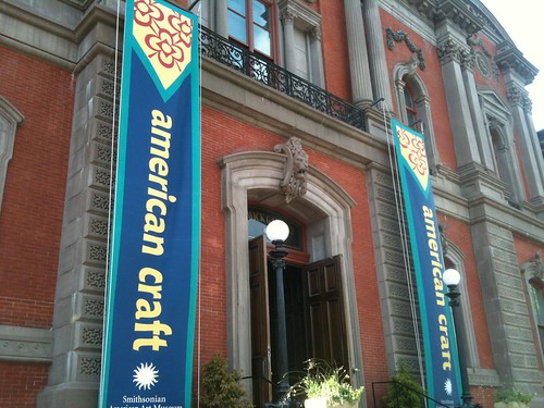
I never thought I'd be asked to prove my age in order to attend a letter writing event. And I still would, but for a postcard I received from Melissa, of Craftgasm, inviting me to attend a Handi-Hour, hosted by the Smithsonian American Art Museum at the Renwick Gallery, across the street from the White House. The event, which changes themes, costs $20 and gets you two craft beers, a souvenir glass, hors d'oeuvres, and all the crafting you can handle for two and a half hours. The July event was co-hosted by the National Postal Museum and the theme was "postal modern" so, of course, I had to attend. 

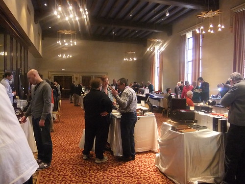
I really didn't know what to expect. I thought maybe there would be 10-12 people with a few cold brews around a large conference table. I was wrong. 

HandiHour 5

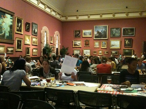
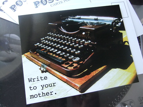
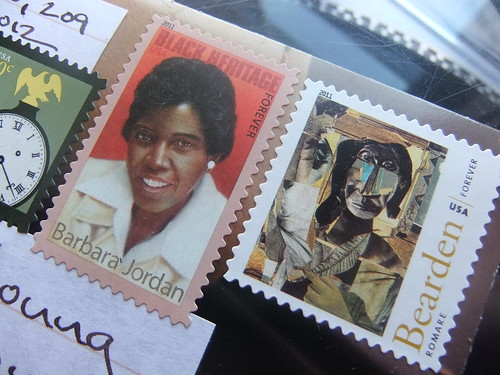
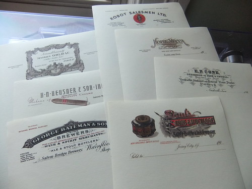
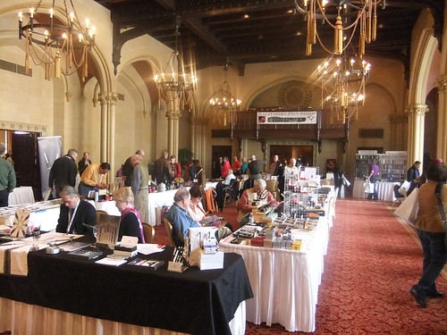
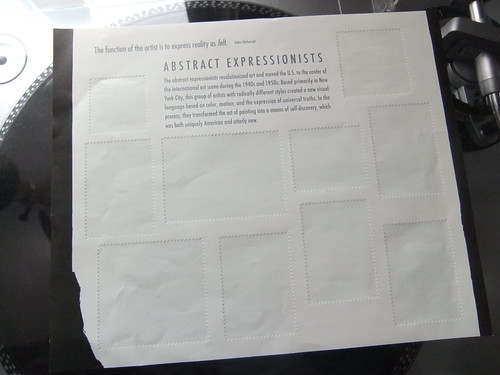
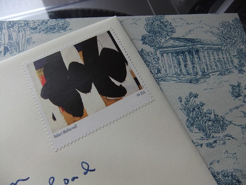
The event filled a ballroom sized space within the gallery, called the Grand Salon, and the crowd spanned all demographics. Beer flowed, a musician played, and crafting was had by all. Between the Renwick and the Postal Museum, the crafting supply table overflowed with quality supplies: colorful calendars, fabric swatches, cool first day covers, canceled stamps, envelopes, stationery, and more. They really brought their A game. 

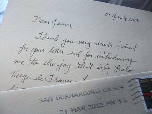
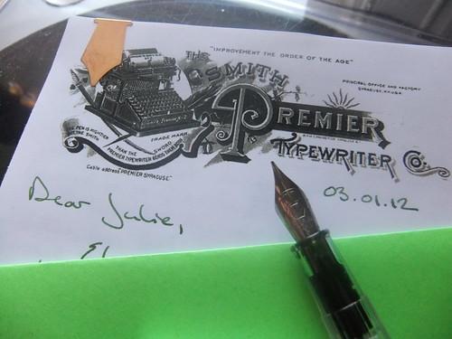
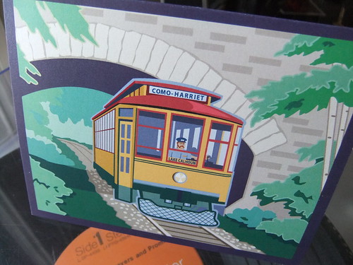
I made several envelopes from cool calendar pages, and wrote a letter (while somewhat under the influence) to the Missive Maven. All letters placed into a box at the event were then posted for free by the Postal Museum!

HandiHour 1

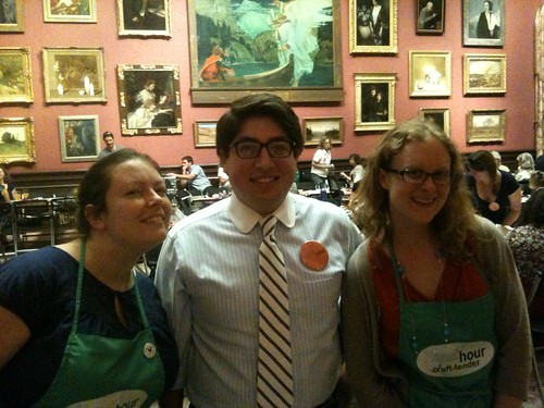
I would have crafted more, but I ran into awesome people from the internet. Melissa stopped by to say hello, and Erin, from the Postal Museum, introduced herself. They were two of the masterminds behind the July Handi-Hour. Turns out, we read and adore many of the same letter writing blogs. 

HandiHour 6

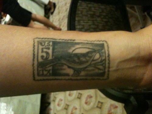
In meeting other people from the internet, I was pleased to meet Ashley, an intern at the Postal Museum, who shared her fantastic tattoo. By the time I'd crafted, chatted, and used both my drink tickets, it was eight o'clock and the event was over. So, I packed my bag with a few extra craft items and my commemorative Handi-Hour glass, and called it a night. Just like that, the Handi-Hour came and went, a whirlwind of crafting and creativity in a town otherwise known for its buttoned up demeanor.

Letter writing is almost always solitary activity, its a warm feeling to do write with others. Our community would do well to have more letter writing events. While the Handi-Hour was a good time, this collaboration with the Postal Museum was a one time event. I know other communities have letter writing socials, but I haven't heard of any in my area. I feel a project coming on.  Are any of you, dear readers, in the Washington, D.C. and interested in moving forward the idea of setting up a writing social in our area?

April 1, 2012

Correspondence Shop, an Etsy Store

Write to Your Mother Postcard

I'm pleased to announce the opening of the Correspondence Shop, an Etsy Store. To keep it simple, I need a way to fund my pen, paper, ink, and mail habit. And, I want a way to provide further benefit to you, dear readers. Hence, the store. Available for purchase are postcards based on content previously published here on Everyday Correspondence. The above postcard, appropriately titled, "Write to Your Mother," printed on luxurious 130 lb. paper stock, is based on a picture I posted of my Royal Portable Typewriter, Agatha.

Insulting Emily Postcard

The 4.25" x 5.5" postcards come in packs of five and arrive in some classy packaging. Emily Post, featured in the "Insulting Emily Postcard," would approve.

Hotel Mecca Postcard Back

Satisfying fountain pen and rollerball pen enthusiasts, the back of each postcard is friendly to the inks used in those pens, although those inks will need a minute to dry. 

Sometimes you just want to send a brief message, sometimes you don't quite have 45 cents. Whatever your reason for sending a postcard, spruce it up and send it on one of these from the Correspondence Shop, available for purchase through the link at the top right of the site.

March 29, 2012

Let's Talk Paper

DSCF7094

Loving letters, I've grown very particular about the paper on which I write. If you've received a letter from me in the last year, chances are it was written on ivory G. Lalo Vergé de France laid paper. It is hands down my favorite paper to write one. I like it so much, when I got my first job out of law school, I ordered 250 pages of it with matching envelopes for writing thank you notes.

The Vergé de France is a luxurious French paper. Differing from the American preference for 100% cotton in premier papers, the French prefer a blend. I read some time ago the French prefer 30% cotton and 70% wood pulp in their premier papers, as the cotton fibers add a nice feel to the paper but, because of the long fiber length, 100% cotton paper is too limp for French sensibilities. By blending cotton fiber with wood pulp, the French produce a stiff paper with a fine feel.

Possibly because of this unique composition, I believe Vergé de France is 25% cotton 75% wood pulp, the paper takes fountain pen ink very well. Ink dries on the paper almost immediately, even when applied with the wettest of nibs. 

Letter on G. Lalo

As it's sold through several online stores, popular with the fountain pen crowd, I thought everyone knew of the Vergé de France. And, naturally, I assumed everyone loved it the way I do. So, when I began listening to the Fountain Pen Geeks Podcast (which I highly recommend), I was confused when they gave all their devotion to Clairefontaine and Rhodia paper. I was also thrown when the hosts expressed their displeasure with J. Herbin inks. 

So, I took it upon myself to write the Geeks a letter. To make a point, I wrote the letter on Vergé de France with J. Herbin Cacao du Bresil, using my favorite pen. I noted the paper on which I wrote, and as to the inks, pointedly asked, "What gives?"

Well, I was positively tickled when the Geeks read my letter on the air. It spawned a ten minute conversation on the Vergé de France and J. Herbin ink. The consensus was: the ink is awesome, and the paper is superior to Rhodia and Clairefontaine for writing letters. Appropriately, the Geeks gave away a pad of the Vergé de France during the show. To top it off, Geek Eric sent me a response, written on champagne Vergé de France, in a matching envelope, with Cacao du Bresil, which he purchased after receiving my letter. Please forgive the Charlie Sheen reference, but: #WINNING.

BREAKING NEWS

Postal Museum Tweet

The National Postal Museum "likes the looks" of Everyday Correspondence. The museum tweeted me two weeks ago, but I'm still pretty jazzed about it.

March 14, 2012

Waterman's 32A, Back in the Saddle

Waterman's #32A

I'm so glad Martin Ferguson let me sneak in at the end of the day at the Baltimore Pen Show. In a few minutes, Martin was able to re-sac my current favorite fountain pen, my grey and red Waterman's 32A, armed with a delicious 14 carat gold flexible nib. I've sincerely missed writing with this pen. To welcome the 32A back into the fold, I filled the new sac with J. Herbin Cacao du Bresil - my most favored ink - and wrote a letter to my pen pal in Australia on some smooth white Clairefontain Triomphe paper.


It doesn't pick up well in photographs, but Cacao du Bresil is one of those inks which evades classification. On first glance, it might look black. On second glance, possibly brown... or grey, maybe even sepia. It's very complex. Cacao du Bresil is the perfect color for the 32A, a pen from the 1930s which reflects the dignified austerity of its time. Seeing that I had a color scheme on my hands, I had to follow through. I bound the letter with a shiny Levenger clip, and packaged the letter into an envelope I made from a Waterman pen ad.

Multiple Stamps

I posted the letter with a few great stamps. I hope this letter sticks out as much as my first letter to this pen pal, which arrived in much flashier packaging. It was a real joy writing this letter, I hope it's the beginning of a lengthy new era with my 32A.

March 12, 2012

Giveaway Winners

Dear Readers, 

Thank you to all who entered the vintage letterhead sample pack giveaway

There were 23 entries. I wrote each entry down and numbered them on a sheet of paper. Then, I went to random.org and had the generator select three random numbers between 1 and 23. Easy peasy.

Without further ado, the lucky winners are:
  • Twitter user, @lucasmines
  • Commenter, Jackie Flaherty
  • Commenter, paperedthoughts
Winners: Please use the "Contact Me" link on the top right of this page to send me your mailing addresses, and I'll get your letterhead to you ASAP. 

To all others: Thank you, again, for entering the giveaway. My favorite part of giveaways is learning more about the people who read Everyday Correspondence. You're all so interesting! I'd love to hear more from each of you, both on Twitter and in the comments. You have so much to add and so many great ideas to share.

Very truly yours, 

James

P.S. Don't forget, the images printed on the letterhead for the giveaway are always available for free download in the vintage letterhead archive!

March 9, 2012

Giveaway: Vintage Letterhead Sample Packs

DSCF7565

I'm in the middle of a transition which requires me to create space in my home. Part of that process involves going through all my letter writing paraphernalia. And, wouldn't you know it? I have more than I require. A couple of years ago, when I had only temporary access to a color laser printer, I printed a bunch of refurbished vintage letterhead images onto half sheets of paper. Shortly thereafter, I lost them. 

Today I found the stash. 

Because I don't need so many copies, I'd like to give some away to you, dear readers. I have three packs of seven letterheads, printed on Southworth 25% cotton, linen finish paper, which I'll be giving away at random. There are two ways to enter this giveaway, first by commenting on this post with your favorite writing implement or favorite color ink, and second, by Tweeting "I'm entered in the vintage letterhead #giveaway at http://bit.ly/xdcOYg via @EverydayCorresp".

You may earn one entry per described entry method. So long as you live on the planet Earth, you are eligible to win. Entries must be received by 12:01 a.m. p.m. eastern time on Monday, March 12, 2012. I'll announce the winners in a post sometime on Monday afternoon. Winners will then have to contact me with their mailing address for delivery.

Enter quickly via 

March 4, 2012

On the Road: Baltimore Pen Show 2012

DSCF7532

I find myself in Baltimore about once a month, but yesterday proved a rare event: a good time in Charm City. Held in two beautiful rooms at the Tremont Grand Hotel, the second annual three day pen-fest known as the Baltimore Pen Show proved a mighty fine affair. I arrived late morning on the second day of the show, and was immediately greeted by rows of vintage pens right up my alley. At the show, I had three priorities: find a pretty pen, buy a refill for my Pelikan R600, and repair at least one of my favorite pens currently on the 'injured list.'

Baltimore Pen Show 2012

Because my collecting instinct has been dormant for a while, there was nothing I was actively seeking at this show. So, I took it upon myself to carefully scan every table of vintage pens for something to catch my eye. As it turned out, the first row I walked down pressed every one of my collecting buttons. There were several tables of all-metal ring top pens and a good selection of dip pens and dip pen holders. I got so caught up in gawking and examining the fine specimens, I completely forgot to take pictures. In any case, I made a mental note of these pens, and continued my journey around the rest of the show.

Baltimore Pen Show 2012

At the end of the first room was a doorway to a second room, equally as large as the first. It would be here where all of my commercial activity for the day would take place. Strolling around the tables, I found myself at a display of Cross pens, aka pens manufactured by the A.T. Cross Company. Truth be told, I don't care for any of the Cross fountain pen offerings, but I swoon for their classic ballpoint model, the Century. A thin, well-balanced pen with good weight, the Century fits well into both a coat pocket and a hand. Like many pen manufacturers which produce popular models, Cross released the Century in many different finishes. So while I already own three (brown, baby blue, and rolled gold) I still keep my eyes open for variations on the iconic pen.

Baltimore Pen Show Banner

The selection of Cross pens I was perusing happened to be owned by a former decades-long Cross employee. His table included many rare Cross fountain pens - in which I had no interest, and a couple ballpoints. The one which caught my eye was the fine piece pictured below. Spoiler Alert: I bought it. While I was taken with the pen, the gentleman explained to me that the model, which I believe is the 23k gold-plated Streamers model from the Cross "Jewelers Collection" released in the mid 1990s, was widely panned as unattractive and undesirable.

DSCF7542

I think we can all agree, people in the 90s had terrible taste. After engraving, Cross lightly coated the pen so the grooves wouldn't irritate the hand. As a result, the pen has a surprisingly smooth finish. While I knew the pen had to be mine, I exercised some self control, made mental note of the item, and continued on my tour of the show. But at the end, after deciding none of the ring tops or dip pens were items I couldn't live without, I returned to the Cross table and bought the 80s oddity. Pen purchase down, I picked up some rollerball refills for my Pelikan R600 and ogled some excellent quality pads of pen-themed stationery from Anderson Pens.

Then, I sought out a repairman. There were three people at the show doing pen repairs, two of them were focusing solely on nib modification. But luckily, Martin Ferguson of martinspens51.com was there doing repairs. 

Martin of Martin's Pens

I went to Martin with a mere 10 minutes left in the show, so I only had time for one repair. I selected my Waterman's #32A for a quick sac replacement. There are number of filling mechanisms for fountain pens, many of which require a rubber sac to hold the ink inside the body of the pen. Over time, these sacs dry out and crack, rendering the pen incapable of holding ink. The sac in my Waterman's fell apart a little over a year ago, and I've been itching to repair it. Thankfully, in just a few minutes, Martin was able to send my Waterman's back into my writing rotation.

The show over for the day, and the bar rolled out for the exhibitors only after-party, I was the last show attendee out of the door. Leaving the hotel, I was already looking forward to next year's show - because I had a really good day ...in Baltimore.

March 1, 2012

The Pen is Mightier, But...

DSCF7515

It's 65 and sunny in Washington, D.C. Spring is in the air. As such, I'm feeling mighty green. So, today I pulled back the curtains, threw open the windows, and wrote a letter while sitting in the sun.

Feeling a tad industrious, I printed off the newly refurbished Smith Premier Typewriter Co. vintage letterhead image onto 28 lb. Hammermill color copy paper. Then, I picked up my desperately in need of cleaning Parker 45 loaded with Platinum Blue Black ink, began writing - and then promptly capped the pen an tossed the sheet of paper. The 45 was skipping and the Blue Black was bringing me down.

Because each of my vintage fountain pens requires repair, I took a chance on my first fountain pen purchase, a steel-nibbed Waterman Kultur. To load it, I cracked a new bottle of J. Herbin Vert Empire. It was sooo worth it. A fresh pen and some green ink kicked my mood into high gear, and I think the result was a pretty good letter.

Finishing the whole thing off with one of my Levenger paper clips and a homemade envelope made from green card stock.

Normally, I'd wait for a letter to arrive in the mailbox of its recipient before posting about it. But my afternoon cheer didn't want to wait to share The Smith Premier Typewriter Co. image with you, dear readers. If vintage letterheads are your thing, the image is now available for download in the Vintage Letterhead Image Archive. I'm pretty proud of this image, it's relatively good quality and I love the company logo of a typewriter atop a sword and plume, with the line, "The pen is mightier than the sword, but the Smith Premier Typewriter bends them both." Plus, that capital "P" is gorgeous.

February 26, 2012

Turkish Postage

DSCF7508

I got a letter from Turkey! I've never seen Turkish mail before, so I must ask you, dear readers, about the placement of the postage. Is it normal to place the stamps at the end of the envelope like the above letter? It seems like it would be standard, given the placement of the cancellation mark. Can anyone confirm this is standard placement for Turkish post, or offer an explanation for the reason behind this curious formatting?

It may be that there is no compelling reason behind the placement, other than "That's how Turkey does it." And that would be fascinating. I love it when I encounter countries and cultures which do things differently for reasons other than necessity.

UPDATE: An anonymous commenter has provided us with an answer. On a side note, Turkey is definitely in my top five countries to visit. 

February 9, 2012

Hotel Stationery: Hotel Monaco

DSCF7424

I often judge a hotel on its stationery. It's one of those items whose presence - like a bowl full of brown-less M&Ms - indicates a particular attention to detail. And, the better the stationery, the more props I'm inclined to throw a particular hotel's way. But, every once in a while, it's not about good or bad, but "huh?" 

A summer or so ago, I checked into the Hotel Monaco in the Penn Quarter neighborhood of Washington, D.C. And, as I always do when settling into a hotel room, I immediately went to the desk in search of hotel stationery. What I found perplexed me. There were several 8.5" x 11" sheets of fair quality stationery, printed with the hotel's logo and bearing the hotel's address and contact information. And in place of number 10 sized envelopes were a set of fine quality A6 envelopes, printed with the appropriate hotel information. For the uninitiated, A6 envelopes measure 4.75" x 6.5".

DSCF7429

I'm not sure why the Hotel Monaco decided to offer me incompatible stationery and envelopes, but not to be a beggar and a chooser, I took them both. And, when I finally decided to use some of the hotel stationery, it gave me the opportunity to craft my own brightly colored envelope.

This stationery was sent off as my first letter to a new pen pal from Australia. I really wanted it to stand out in her stack of afternoon mail. So, in addition to using attention-grabbing paper for the envelope, I used a sticker type seal from Papyrus (they include a pack of these seals with every set of envelopes) for glint. And, as a goodwill gesture, I bound the pages of the letter with a fountain pen nib paper clip/bookmark/neat thing from Levenger.

The letter should have arrived in Queensland a week or so ago, I can't wait to hear back from my new Aussie pen pal.

January 26, 2012

Desk Essentials: Postal Scale

DSCF7475

"How many ounces do you think this is?" I used to ask that question all the time, defaulting to the greater possible weight, likely spending unnecessary postage for envelopes which felt a little thick. But, now with my handy dandy postal scale, I am sure of how much postage any particular envelope or parcel requires.

At $9.99 I probably paid a bit too much for this spring scale, but Rite Aid played to my weakness by displaying it next to the packing tape on a day when I really needed to mail a lightweight package of uncertain weight. But, by the end of the year, I expect to recuperate the cost of the scale in saved postage. My dream, though, is to get a digital scale. My local Post Office sells an over-priced digital scale, but it's got all the USPS imagery all over it. Who knows, I may have a weak moment while waiting in line to mail my mother a birthday present this October...

But, if you're a normal, rational person who is in the market for this desk essential, there are many more affordable options (sans fun USPS stickers) available online.

January 20, 2012

Out of Stamps

DSCF7430

I hate when this happens. I find a limited run of stamps I really, really love - the Abstract Expressionists series, which I think was the best of 2010. And then, I run out - I used the last stamp, the large Jackson Pollock, today. Damn it. 

January 17, 2012

A Thoughtful Thank You

DSCF7423

My dear friend, Grace, is a most fastidious sender of thank you notes. In this week's post, she kindly sent me a card thanking me for including her in a gift exchange I organized. While her prose was kind, her script unique and attractive, my favorite element of this card is the card itself. 

Grace and I are friends from high school back in the Twin Cities (for readers not familiar with the American Midwest, they are St. Paul and Minneapolis, in Minnesota), and we each found ourselves on the East Coast - myself in D.C. and her in New York. While we're both happy living short distances from the Atlantic, we each have deep affection for our hometowns. So, it's become almost a personal hallmark for her to send cards from (and often about) Minneapolis. I don't know where she buys her stationery, but I strongly approve.

This card, with colors appearing more saturated in person, depicts a historic Minneapolis/St. Paul trolley, before the tracks were torn up and the trolleys retired in the mid 20th century. I like the simple image so much, I've added it to the pile unusually sized items (it's 4" x 5.25") which I plan on having framed.

Wow, three paragraphs on simple card. Behold: the power of a thoughtfully chosen, well written thank you note. 

January 5, 2012

A Classic Letter

DSCF7108

After much consideration, I decided to respond to the modern black and white pen pal letter with a traditionally themed letter of my own. I chose to write on some of my most favorite stationery, which I use very sparingly - the Toile de Jouy which I purchased as a souvenir from Thomas Jefferson's Monticello. The design is attractive, the paper takes fountain pen ink pretty well, and the envelopes feel fantastic.

DSCF7116

And then, as an homage to the original letter, I used a very modern art stamp for postage - my favorite set of postage stamps released in recent memory. And, I finished it off with a faux wax seal. I have no idea why, but as hard as I try, and as much as I practice - I can never seem to pull off a good wax seal on an actual letter! It drives me nuts. This time around, I even put on twice as much faux wax as I normally would, and it Still.Didn't.Turn.Out. Not that I'm going to stop using seals, but I may just have to admit it's another one of those things I'll just never be able to do, along with making a good pot of coffee and whether my father's birthday is on May 3 or 4. Oh well.