It's 65 and sunny in Washington, D.C. Spring is in the air. As such, I'm feeling mighty green. So, today I pulled back the curtains, threw open the windows, and wrote a letter while sitting in the sun.
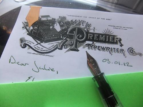
Feeling a tad industrious, I printed off the newly refurbished Smith Premier Typewriter Co. vintage letterhead image onto 28 lb. Hammermill color copy paper. Then, I picked up my desperately in need of cleaning Parker 45 loaded with Platinum Blue Black ink, began writing - and then promptly capped the pen an tossed the sheet of paper. The 45 was skipping and the Blue Black was bringing me down.
Because each of my vintage fountain pens requires repair, I took a chance on my first fountain pen purchase, a steel-nibbed Waterman Kultur. To load it, I cracked a new bottle of J. Herbin Vert Empire. It was sooo worth it. A fresh pen and some green ink kicked my mood into high gear, and I think the result was a pretty good letter.
Finishing the whole thing off with one of my Levenger paper clips and a homemade envelope made from green card stock.
Normally, I'd wait for a letter to arrive in the mailbox of its recipient before posting about it. But my afternoon cheer didn't want to wait to share The Smith Premier Typewriter Co. image with you, dear readers. If vintage letterheads are your thing, the image is now available for download in the Vintage Letterhead Image Archive. I'm pretty proud of this image, it's relatively good quality and I love the company logo of a typewriter atop a sword and plume, with the line, "The pen is mightier than the sword, but the Smith Premier Typewriter bends them both." Plus, that capital "P" is gorgeous.
2 comments:
Such a charming post! Made me smile and I read with chin in palm. :) I like. I like Herbin inks. Ooh, la!
Yay! Comments like that make me air-five. Thanks, Limner.
James
Post a Comment