March 14, 2012
Waterman's 32A, Back in the Saddle
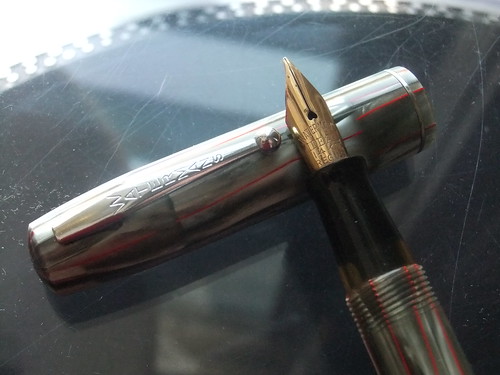
I'm so glad Martin Ferguson let me sneak in at the end of the day at the Baltimore Pen Show. In a few minutes, Martin was able to re-sac my current favorite fountain pen, my grey and red Waterman's 32A, armed with a delicious 14 carat gold flexible nib. I've sincerely missed writing with this pen. To welcome the 32A back into the fold, I filled the new sac with J. Herbin Cacao du Bresil - my most favored ink - and wrote a letter to my pen pal in Australia on some smooth white Clairefontain Triomphe paper.
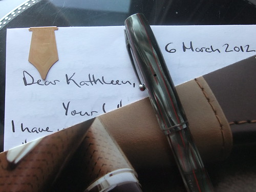
It doesn't pick up well in photographs, but Cacao du Bresil is one of those inks which evades classification. On first glance, it might look black. On second glance, possibly brown... or grey, maybe even sepia. It's very complex. Cacao du Bresil is the perfect color for the 32A, a pen from the 1930s which reflects the dignified austerity of its time. Seeing that I had a color scheme on my hands, I had to follow through. I bound the letter with a shiny Levenger clip, and packaged the letter into an envelope I made from a Waterman pen ad.
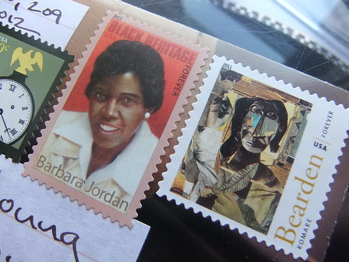
I posted the letter with a few great stamps. I hope this letter sticks out as much as my first letter to this pen pal, which arrived in much flashier packaging. It was a real joy writing this letter, I hope it's the beginning of a lengthy new era with my 32A.
March 12, 2012
Giveaway Winners
Dear Readers,
There were 23 entries. I wrote each entry down and numbered them on a sheet of paper. Then, I went to random.org and had the generator select three random numbers between 1 and 23. Easy peasy.
Without further ado, the lucky winners are:
- Twitter user, @lucasmines
- Commenter, Jackie Flaherty
- Commenter, paperedthoughts
To all others: Thank you, again, for entering the giveaway. My favorite part of giveaways is learning more about the people who read Everyday Correspondence. You're all so interesting! I'd love to hear more from each of you, both on Twitter and in the comments. You have so much to add and so many great ideas to share.
Very truly yours,
James
P.S. Don't forget, the images printed on the letterhead for the giveaway are always available for free download in the vintage letterhead archive!
March 9, 2012
Giveaway: Vintage Letterhead Sample Packs
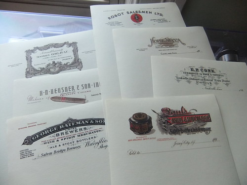
I'm in the middle of a transition which requires me to create space in my home. Part of that process involves going through all my letter writing paraphernalia. And, wouldn't you know it? I have more than I require. A couple of years ago, when I had only temporary access to a color laser printer, I printed a bunch of refurbished vintage letterhead images onto half sheets of paper. Shortly thereafter, I lost them.
Today I found the stash.
Because I don't need so many copies, I'd like to give some away to you, dear readers. I have three packs of seven letterheads, printed on Southworth 25% cotton, linen finish paper, which I'll be giving away at random. There are two ways to enter this giveaway, first by commenting on this post with your favorite writing implement or favorite color ink, and second, by Tweeting "I'm entered in the vintage letterhead #giveaway at http://bit.ly/xdcOYg via @EverydayCorresp".
You may earn one entry per described entry method. So long as you live on the planet Earth, you are eligible to win. Entries must be received by 12:01 a.m. p.m. eastern time on Monday, March 12, 2012. I'll announce the winners in a post sometime on Monday afternoon. Winners will then have to contact me with their mailing address for delivery.
Enter quickly via Tweet
March 4, 2012
On the Road: Baltimore Pen Show 2012
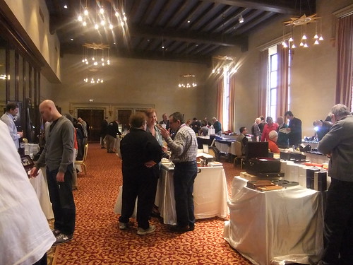
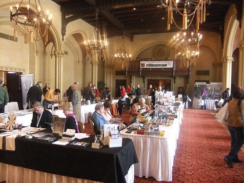
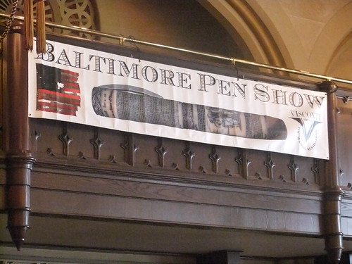
I find myself in Baltimore about once a month, but yesterday proved a rare event: a good time in Charm City. Held in two beautiful rooms at the Tremont Grand Hotel, the second annual three day pen-fest known as the Baltimore Pen Show proved a mighty fine affair. I arrived late morning on the second day of the show, and was immediately greeted by rows of vintage pens right up my alley. At the show, I had three priorities: find a pretty pen, buy a refill for my Pelikan R600, and repair at least one of my favorite pens currently on the 'injured list.'

At the end of the first room was a doorway to a second room, equally as large as the first. It would be here where all of my commercial activity for the day would take place. Strolling around the tables, I found myself at a display of Cross pens, aka pens manufactured by the A.T. Cross Company. Truth be told, I don't care for any of the Cross fountain pen offerings, but I swoon for their classic ballpoint model, the Century. A thin, well-balanced pen with good weight, the Century fits well into both a coat pocket and a hand. Like many pen manufacturers which produce popular models, Cross released the Century in many different finishes. So while I already own three (brown, baby blue, and rolled gold) I still keep my eyes open for variations on the iconic pen.

Because my collecting instinct has been dormant for a while, there was nothing I was actively seeking at this show. So, I took it upon myself to carefully scan every table of vintage pens for something to catch my eye. As it turned out, the first row I walked down pressed every one of my collecting buttons. There were several tables of all-metal ring top pens and a good selection of dip pens and dip pen holders. I got so caught up in gawking and examining the fine specimens, I completely forgot to take pictures. In any case, I made a mental note of these pens, and continued my journey around the rest of the show.
At the end of the first room was a doorway to a second room, equally as large as the first. It would be here where all of my commercial activity for the day would take place. Strolling around the tables, I found myself at a display of Cross pens, aka pens manufactured by the A.T. Cross Company. Truth be told, I don't care for any of the Cross fountain pen offerings, but I swoon for their classic ballpoint model, the Century. A thin, well-balanced pen with good weight, the Century fits well into both a coat pocket and a hand. Like many pen manufacturers which produce popular models, Cross released the Century in many different finishes. So while I already own three (brown, baby blue, and rolled gold) I still keep my eyes open for variations on the iconic pen.
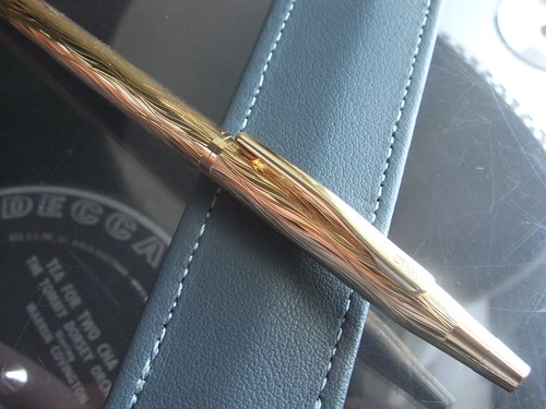
The selection of Cross pens I was perusing happened to be owned by a former decades-long Cross employee. His table included many rare Cross fountain pens - in which I had no interest, and a couple ballpoints. The one which caught my eye was the fine piece pictured below. Spoiler Alert: I bought it. While I was taken with the pen, the gentleman explained to me that the model, which I believe is the 23k gold-plated Streamers model from the Cross "Jewelers Collection" released in the mid 1990s, was widely panned as unattractive and undesirable.
I think we can all agree, people in the 90s had terrible taste. After engraving, Cross lightly coated the pen so the grooves wouldn't irritate the hand. As a result, the pen has a surprisingly smooth finish. While I knew the pen had to be mine, I exercised some self control, made mental note of the item, and continued on my tour of the show. But at the end, after deciding none of the ring tops or dip pens were items I couldn't live without, I returned to the Cross table and bought the 80s oddity. Pen purchase down, I picked up some rollerball refills for my Pelikan R600 and ogled some excellent quality pads of pen-themed stationery from Anderson Pens.
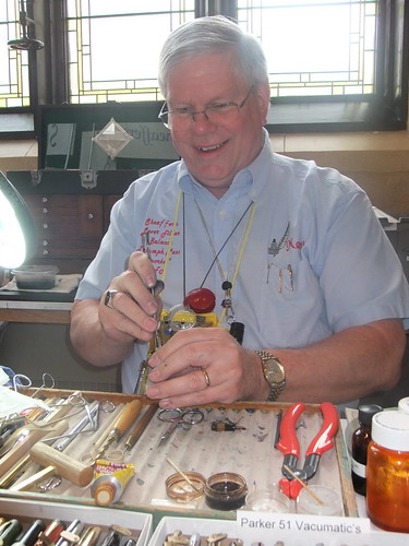
Then, I sought out a repairman. There were three people at the show doing pen repairs, two of them were focusing solely on nib modification. But luckily, Martin Ferguson of martinspens51.com was there doing repairs.

I went to Martin with a mere 10 minutes left in the show, so I only had time for one repair. I selected my Waterman's #32A for a quick sac replacement. There are number of filling mechanisms for fountain pens, many of which require a rubber sac to hold the ink inside the body of the pen. Over time, these sacs dry out and crack, rendering the pen incapable of holding ink. The sac in my Waterman's fell apart a little over a year ago, and I've been itching to repair it. Thankfully, in just a few minutes, Martin was able to send my Waterman's back into my writing rotation.
The show over for the day, and the bar rolled out for the exhibitors only after-party, I was the last show attendee out of the door. Leaving the hotel, I was already looking forward to next year's show - because I had a really good day ...in Baltimore.
Labels:
A.T. Cross,
ballpoint pen,
fountain pen,
On the Road,
pen show
March 1, 2012
The Pen is Mightier, But...
It's 65 and sunny in Washington, D.C. Spring is in the air. As such, I'm feeling mighty green. So, today I pulled back the curtains, threw open the windows, and wrote a letter while sitting in the sun.
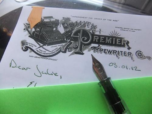
Feeling a tad industrious, I printed off the newly refurbished Smith Premier Typewriter Co. vintage letterhead image onto 28 lb. Hammermill color copy paper. Then, I picked up my desperately in need of cleaning Parker 45 loaded with Platinum Blue Black ink, began writing - and then promptly capped the pen an tossed the sheet of paper. The 45 was skipping and the Blue Black was bringing me down.
Because each of my vintage fountain pens requires repair, I took a chance on my first fountain pen purchase, a steel-nibbed Waterman Kultur. To load it, I cracked a new bottle of J. Herbin Vert Empire. It was sooo worth it. A fresh pen and some green ink kicked my mood into high gear, and I think the result was a pretty good letter.
Finishing the whole thing off with one of my Levenger paper clips and a homemade envelope made from green card stock.
Normally, I'd wait for a letter to arrive in the mailbox of its recipient before posting about it. But my afternoon cheer didn't want to wait to share The Smith Premier Typewriter Co. image with you, dear readers. If vintage letterheads are your thing, the image is now available for download in the Vintage Letterhead Image Archive. I'm pretty proud of this image, it's relatively good quality and I love the company logo of a typewriter atop a sword and plume, with the line, "The pen is mightier than the sword, but the Smith Premier Typewriter bends them both." Plus, that capital "P" is gorgeous.
Labels:
fountain pen,
free,
ink,
J. Herbin,
letterhead,
paper,
pen pal,
snail mail,
vintage letterhead,
Waterman
Subscribe to:
Posts (Atom)